The Smart Hospital Project, housed at the Montreal Children’s Hospital with funding from the Montreal Children’s Hospital Foundation, is developing wireless vital sign monitors for children in the Neo-natal intensive care unit. They needed a brand that reflected the huge leap in technology that this project represented—while reflecting the very human goal behind it: make it easier for parents to hold their newborns.
Challenge
The challenge was to build a brand that reflected modern technological progress—but didn’t feel cold or alienating for parents. The Smart Hospital team was going to need to engage a lot with young (brand new) parents as they researched the technology—so they needed a brand that would facilitate that.
Make technological innovation feel safe for new parents.
Approach
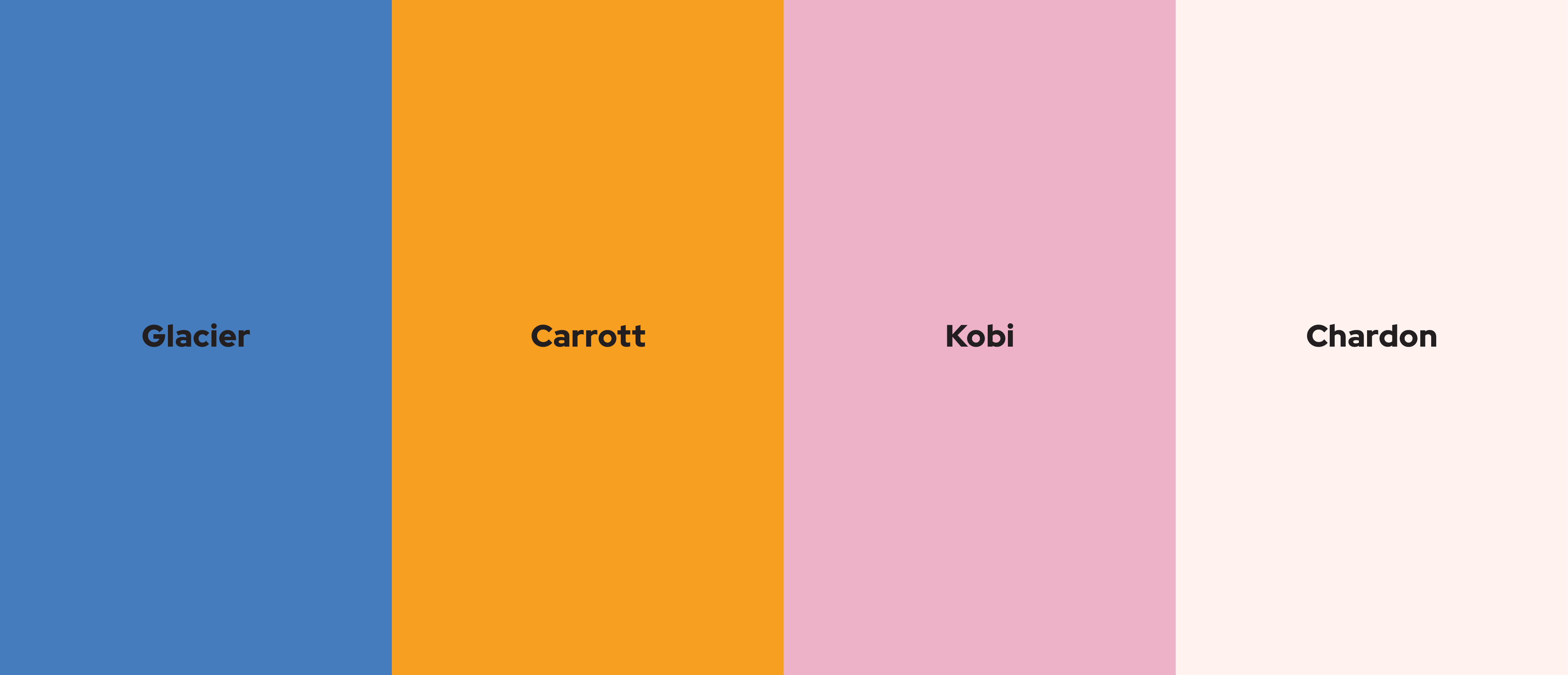
We started by benchmarking modern brands that reflected the same human/tech balance that were interested in. We looked at healthcare, tech, and the social sector as a starting point. Then, we built a brand values compass and mooodboards—helping the client understand what similar brands were doing, and where Smart Hospital could fit into the picture. Then, we moved onto developing 3 logo options for the team to vote on. All of them were debated—but one eventually rose to the top. Finally, the team chose a colour palette that felt warm and kind—and the project was finished.
Execution
Once the brand direction was landed on, we asked the Smart Hospital team what kind of assets they might need. We sent them a simple 20-page style guide for their team to use, a couple key assets so that they could get their social media up and running, and finally gave them assets for use across the hospital.
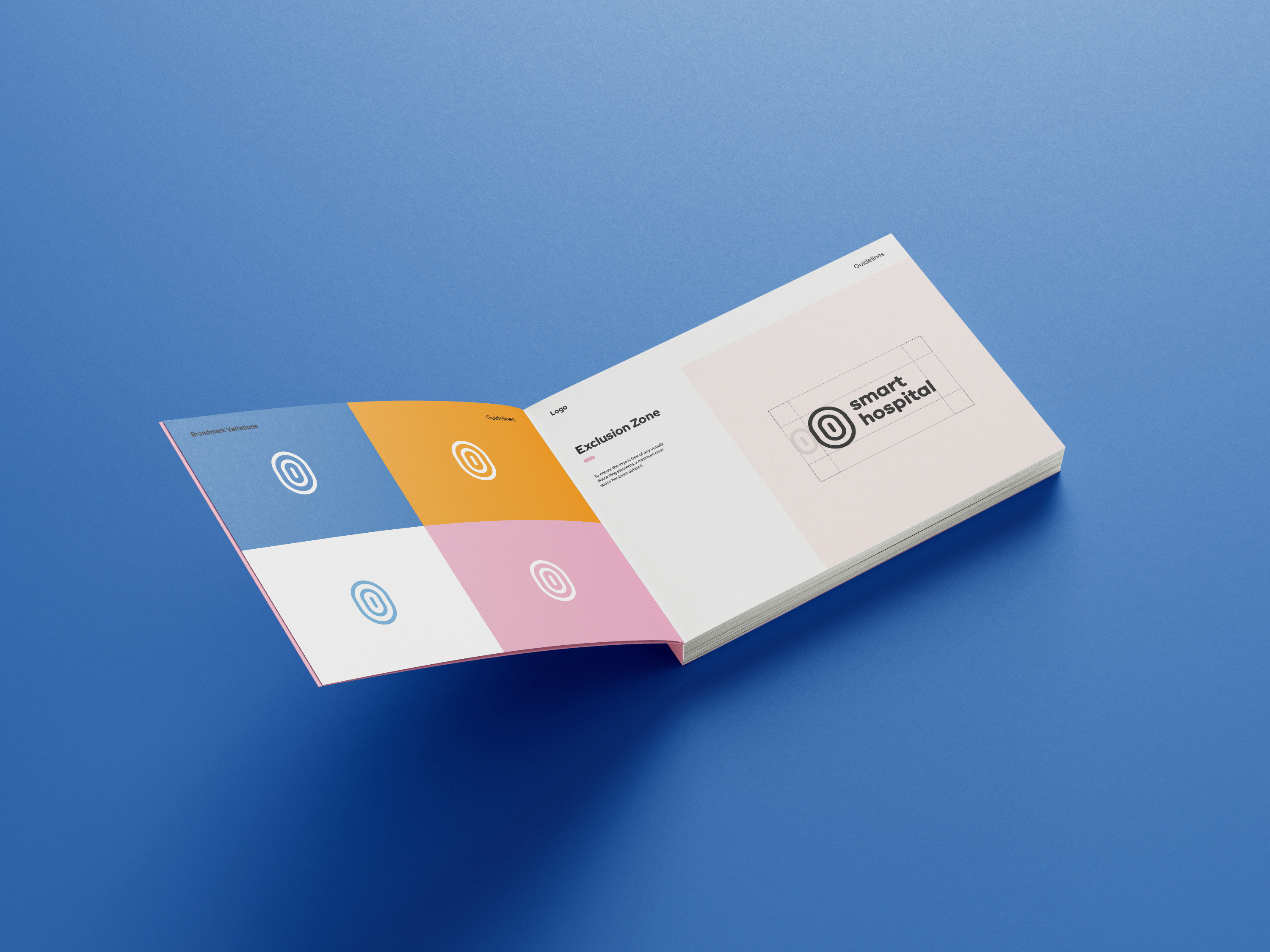
Logo
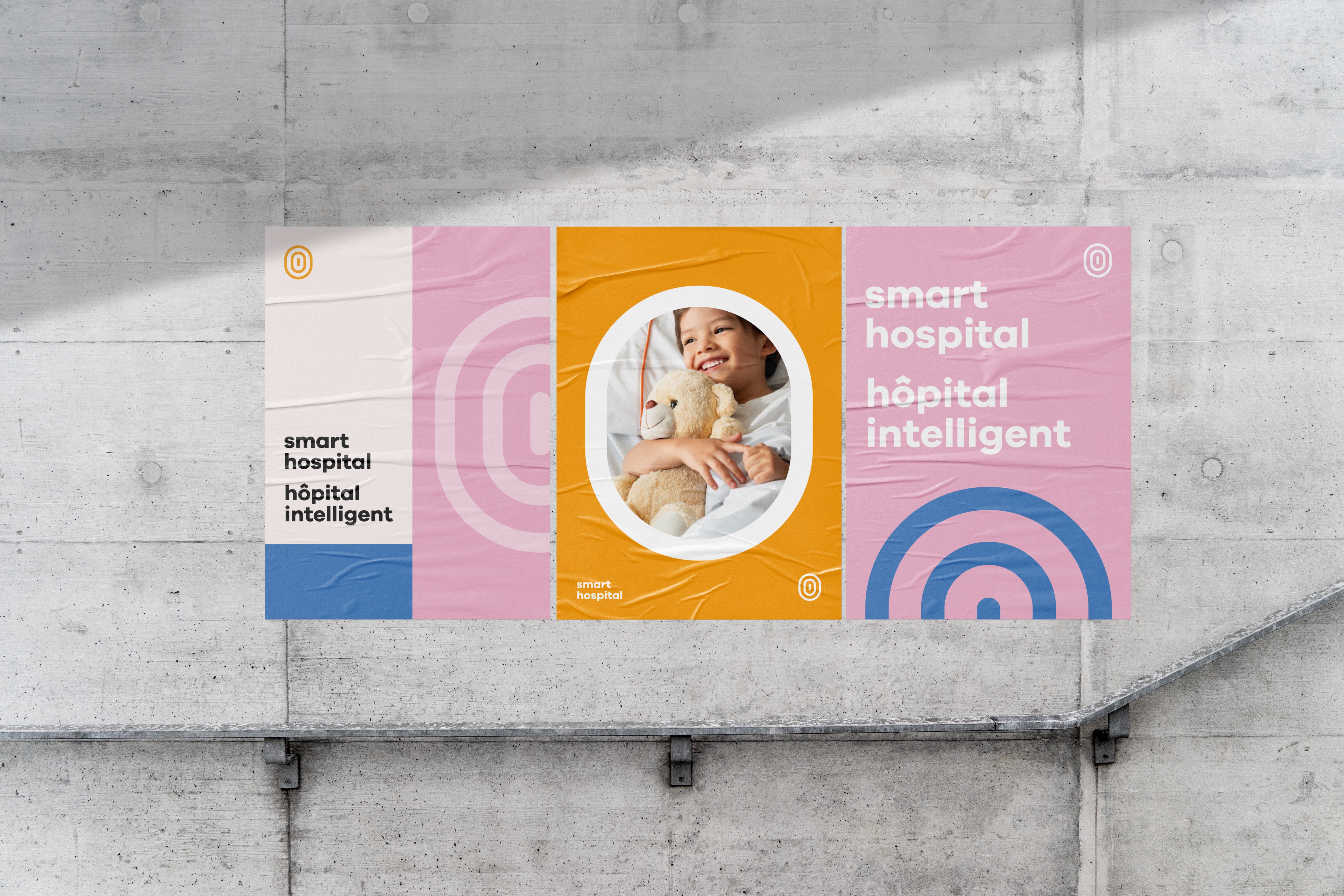
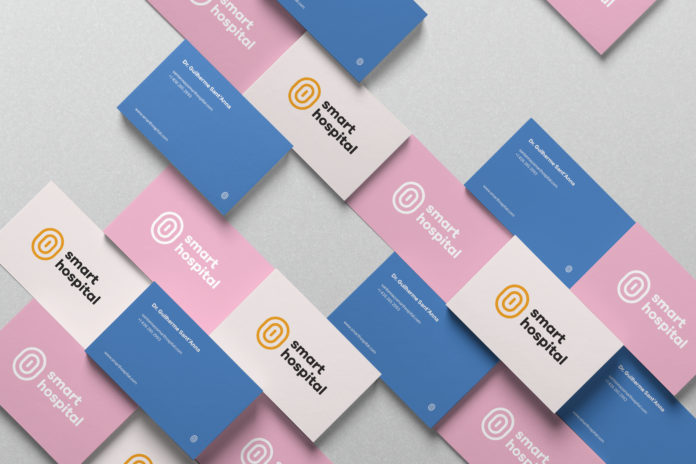
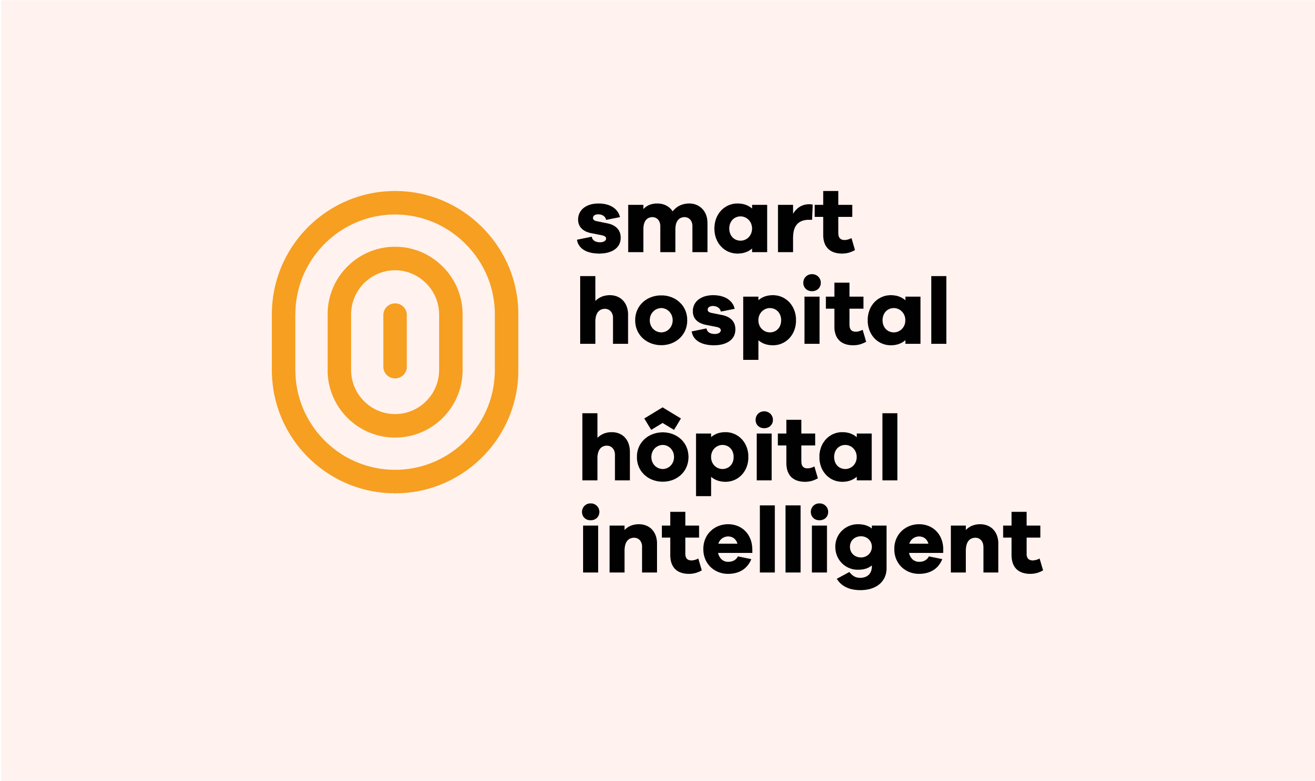
We developed a bilingual logo that could live online and across the Montreal Children’s Hospital as the project was implemented. We delivered several versions of the logo for use in different contexts.
Style Guide
We gave them an easy to use style guide that broke down the use of the logo, colours, and type—among other things. This came with an easy to navigate Google Folder which included all of the assets we had built.
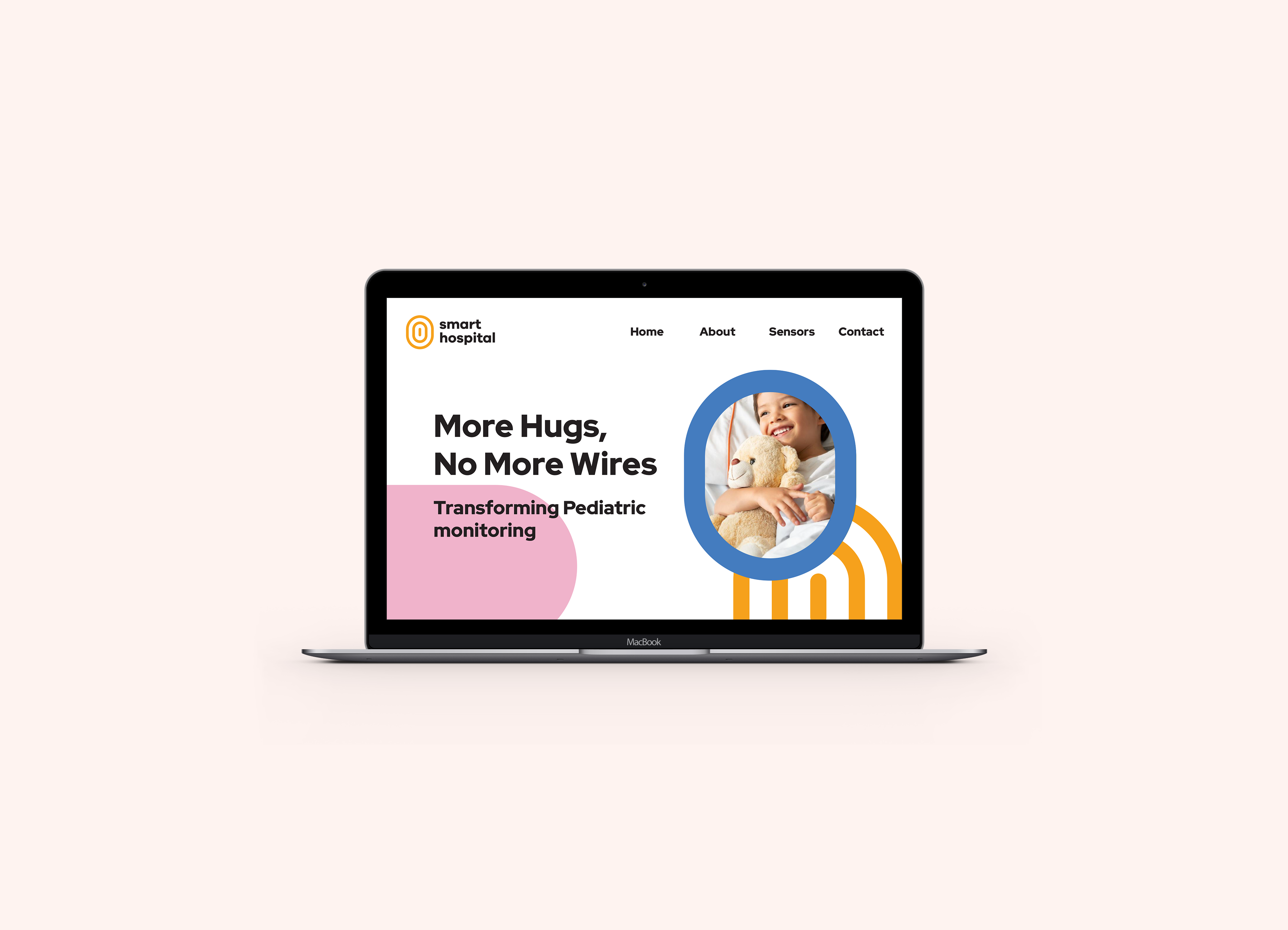
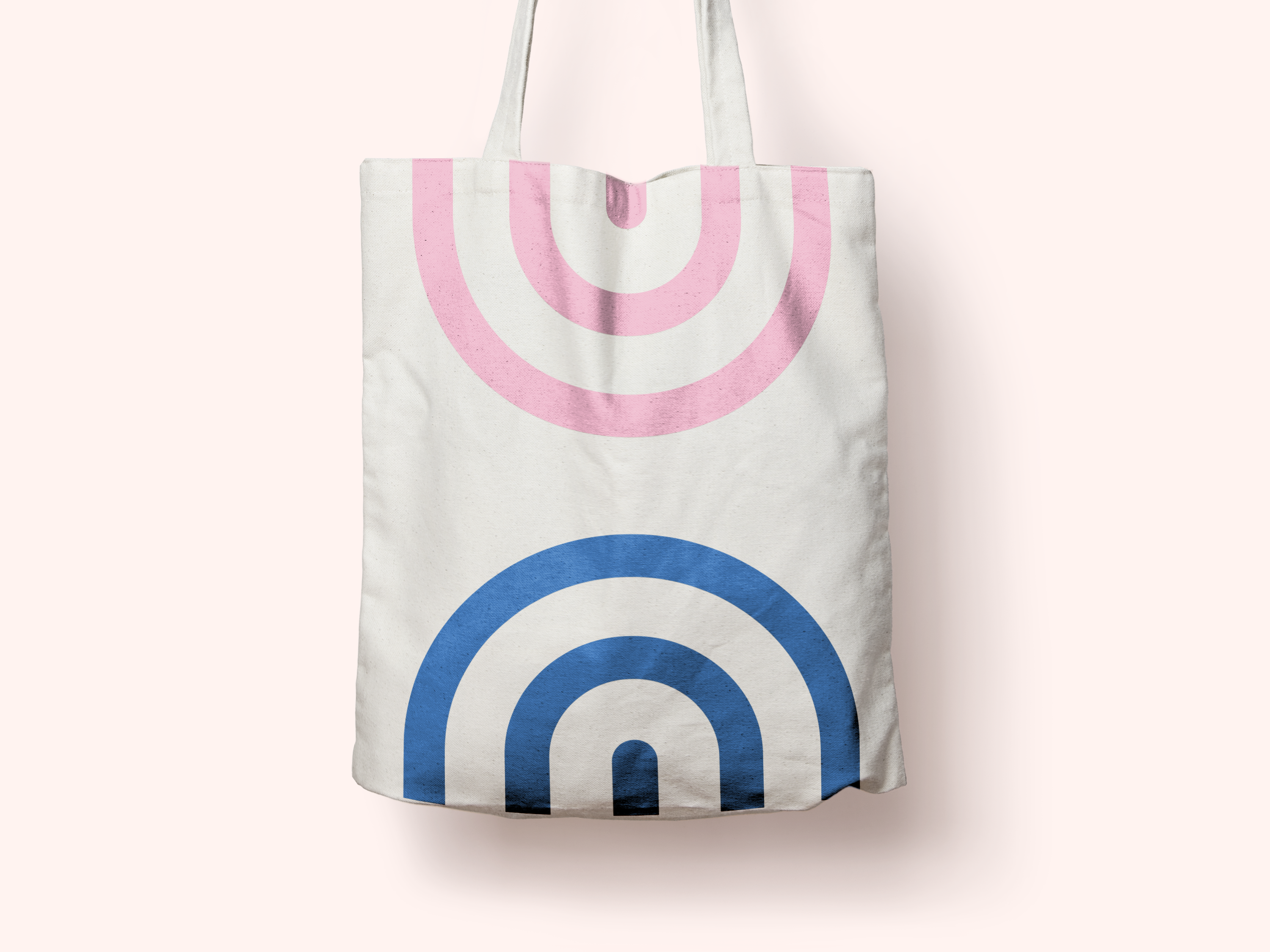
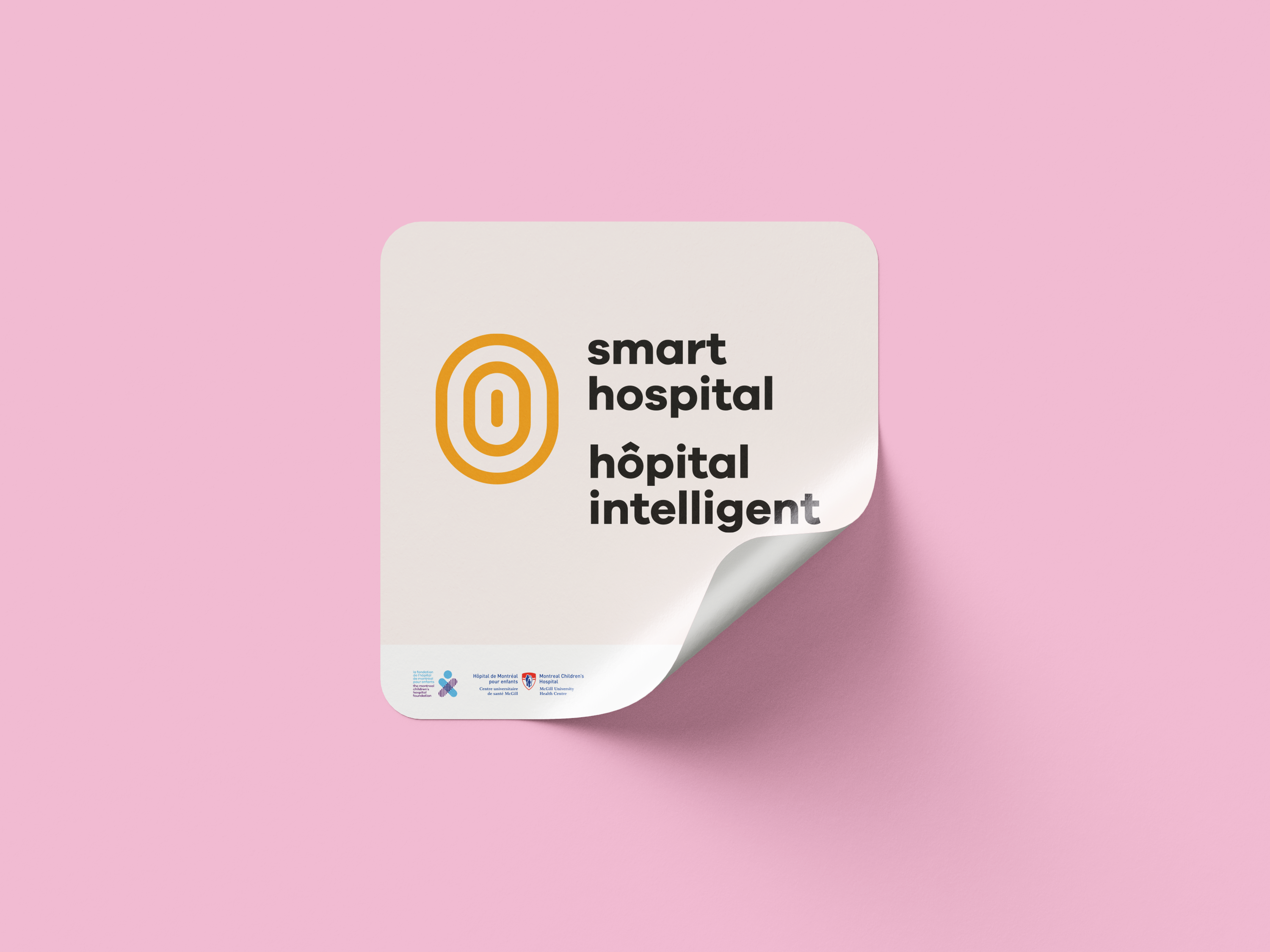
Assets
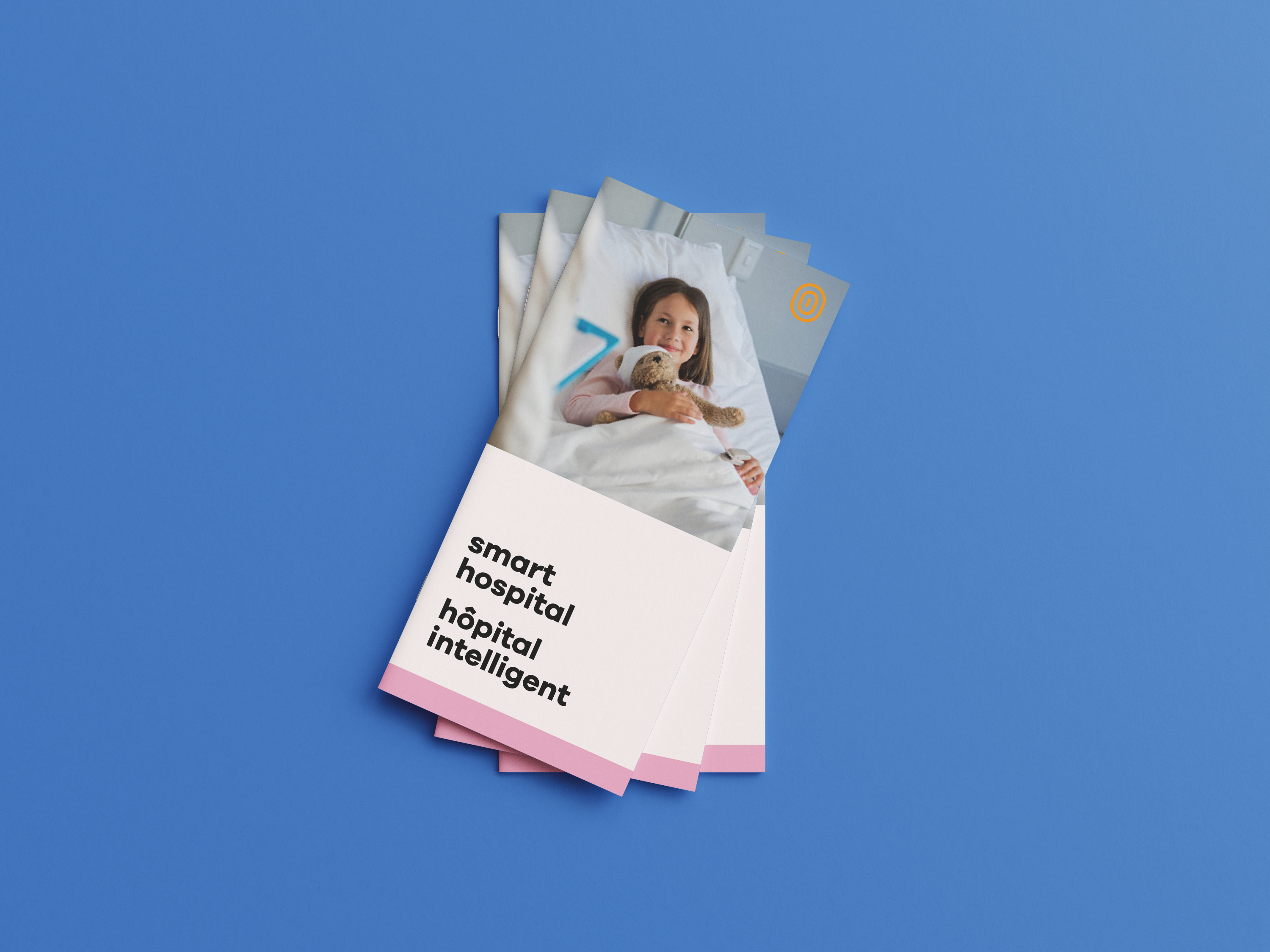
We developed a couple key assets for the team that could be used to get their social media, external presence, and website up and running.
Outcome
We sent the brand to the Smart Hospital and they loved it. It captured the balance of modern and warm that they were looking for. Like many visual branding projects—the outcome is better seen than read.